Pitch Deck Teardown: Minut
Minut, which built a privacy-forward hardware solution that helps Airbnb hosts 'keep an eye' on their properties without trampling over guests' privacy, recently raised a $14 million Series B.

Last month, I wrote about Minut and its $14 million Series B round, an investment that closed in December.
Today, we are sharing the pitch deck the company used to raise the round, led by Almaz Capital. What does Minut do? The startup has built a privacy-forward hardware solution that helps Airbnb hosts “keep an eye” on their properties without trampling over guests’ privacy.
If you want your own pitch deck teardown feature on TC+, you’re in luck; I’m looking for additional companies and pitch decks to feature. More details and a submission form can be found here!
Slides in this deck
- 1 – Cover slide
- 2 – Really cool graphics slide that introduces the form factor of the product
- 3 – Market context slide
- 4 – “What we do” (product/solution slide)
- 5 – “A sensor for every short-term rental” (product/features slide)
- 6 – Another pretty photo of the product
- 7 – Market slide
- 8 – Customer segments slide
- 9 – TAM slide
- 10 – Competition slide
- 11 – Customer validation slide with Trustpilot reviews
- 12 – Customer validation slide with quotes from customers
- 13 – Business model slide (“subscription model that scales”)
- 14 – Traction slide — users, countries, and distribution centers
- 15 – “Minut by Numbers” (KPI slide)
- 16 – Traction slide — ARR growth
- 17 – Traction slide — ARR breakdown, including new, churn, expansion, and existing ARR
- 18 – Traction slide — compounding ARR growth
- 19 – “Plans by country” — Minut’s expansion plans
- 20 – People slide — with a photo of the team
- 21 – Final slide — with a pretty picture!
3 things to love
Traction, traction, traction
When I work with startups, I always tell them that if they have traction, that’s all that matters. In fact, I’ve seen startups raise money with a single slide — and when they do, it’s the traction slide.
If a startup can show that what they are doing is working, it doesn’t actually matter as much if the team is unconventional or the product is ugly: If the company is able to rake in the dough, clearly it’s worth taking a closer look.
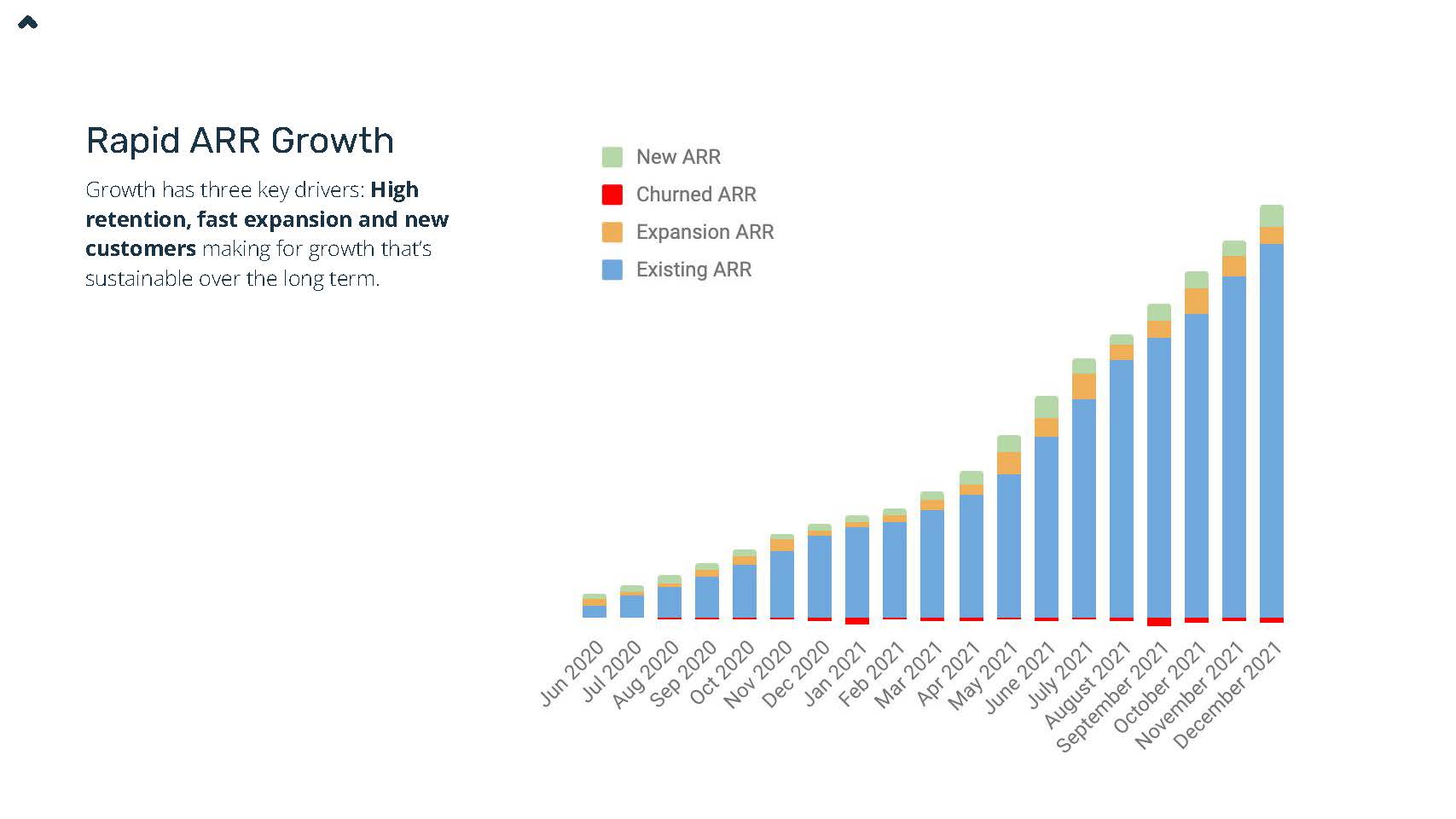
It’s difficult to fake dollars coming in, and Minut does a really great job at telling that story; it breaks down its ARR in a way that makes the story really pop. The first traction slide shows the ARR growth. The next two slides break down the company’s churn rate and show how existing customers become more valuable over time. Super awesome.

[Slide 17] Minut redacted the numbers from its ARR slide, but left the graphs themselves. Using different colors to illustrate new customers alongside market expansion and churn is a really awesome way to tell the story of the company’s growth visually. Image Credits: Minut.
“We are hardware, deal with it.”
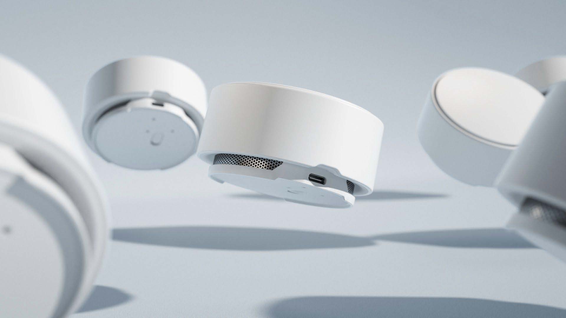
A lot of investors run for the hills as soon as someone mentions physical goods. The second slide in Minut’s deck does two things: It shows how the company has a really well-designed product, but it also throws up a flag saying, “Hey, we do hardware. If you don’t like it, we’re not your people.” It helps that the product photography is beautiful, and a visual aid better explains what the company is all about. Very cleverly done.

It’s pretty baller to throw up a slide without any text — but even without knowing anything about the company at all, this looks beautiful and tells a really important part of the story. Image Credits: Minut.
Explains the complex market really well
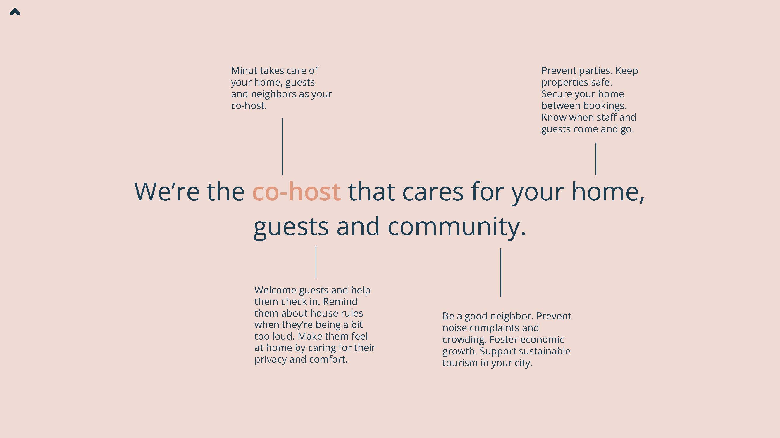
The company has a slogan: “We’re the co-host that cares for your home, guests and community,” which is a fantastic introduction to the company and what it does. Then, it takes each part of the slogan and breaks it down. It’s a masterful storytelling technique that does something really important: It helps build a connection between the company’s mission and what the company needs the investor to understand. It also means that when the slogan is repeated later in the pitch, the company can rely on a short phrase that has depth and richness.

[Slide 4] Here, the company takes its what-we-do sentence and breaks it down how each part of it is an important piece of the puzzle. Image Credits: Minut
In the rest of this teardown, we’ll take a look at three things Minut could have improved or done differently, along with its full pitch deck!


